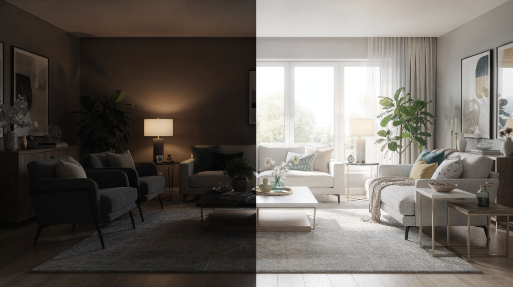
A listing gallery can lose buyers in seconds when rooms feel dark, cramped, or emotionally flat. The fastest way to improve that gallery is usually not expensive gear — it is better light control, cleaner staging, and a few smart composition choices that make rooms feel open and believable. I have walked into enough properties where the architecture was solid but the photos made it look like a cave, and almost every time the fix came down to how light was managed and how the space was edited for the camera.
Why “before and after” matters in listing photography
Most buyers do not study every photo; they scan for space, brightness, and flow. When a room looks wider, cleaner, and more welcoming, it feels easier to imagine living there, which is exactly what stronger staging and lighting are meant to create. I have watched buyers scroll through galleries on their phones, and the listings that stop them are the ones where the first image reads clearly — where the light leads the eye into the room rather than fighting against it.
A good before-and-after story also helps agents and homeowners understand what changed. The room was not “bad” before; it was simply underprepared. Lighting can hide or reveal scale, texture, and cleanliness. Staging can define the room’s purpose so buyers are not guessing. When I show a client the side-by-side comparison, the reaction is rarely about the camera — it is about how the same room suddenly feels intentional.
What usually makes the “before” version fail
In most weak listing galleries, the problem is not one big issue. It is usually a mix of small things that add up. Curtains are closed, cutting off daylight. Mixed bulb temperatures make the space look patchy or yellow. Clutter blocks sightlines and makes rooms feel smaller. Furniture sits too close to walls, leaving awkward empty gaps. The camera position is too low, too close, or aimed straight into a window. I have seen beautifully renovated kitchens look like narrow corridors simply because the photographer stood in the wrong spot and let the overhead lights cast harsh pools of yellow onto the counters.
Even a well-built room can look tired in photos if the light is flat and the staging has no clear purpose. One property I shot had gorgeous floor-to-ceiling windows, but the owner had drawn every blind and turned on a single warm-toned floor lamp. The result was a muddy, amber-tinted frame that made the room feel half its actual size. The architecture was there — the photo just refused to show it.
What changed in the “after” gallery
In a strong transformation, the room usually changes in three ways. Light becomes intentional — windows are open, interior fixtures are turned on, and the shoot is timed for the best available daylight. The room feels edited, not emptied — unnecessary items are removed, but the space still feels livable. The frame shows function and flow — angles are chosen to reveal depth, not just walls. When I work through a property, I am constantly asking whether the light is telling the truth about the volume of the room, and whether the composition guides the eye toward the feature that matters most.
That combination is what turns a decent room into a photograph that sells the room’s value. It is not about making the space look like a showroom; it is about removing the friction that stops a buyer from seeing themselves there.
Lighting changes that make the biggest difference
1) Open the room to natural light
Natural light is the easiest upgrade in property photography. Open blinds, curtains, and shutters fully before shooting so daylight can enter the space and reduce dark corners. I always start a shoot by walking through and opening every window treatment, even in rooms I might not photograph immediately — it changes how I read the flow of light through the entire floor plan. This matters most in living rooms, kitchens, and bedrooms, where buyers respond strongly to brightness and openness. A dark bedroom, no matter how spacious, will always feel smaller and less inviting than a bright one.
2) Match the time of day to the room
The sun’s direction changes how a room reads on camera. East-facing rooms often work best in the morning, while west-facing rooms often look better later in the day. I have learned to schedule shoots around this — if the primary living space faces east, I start there early and move to the west-facing bedrooms in the afternoon. For exteriors, golden hour — early morning or late afternoon — usually gives the most flattering light because shadows are softer and architecture feels warmer. Midday sun can be brutal on front elevations, casting harsh shadows under eaves and washing out facade details.
3) Turn on every usable light
Interior light should support daylight, not fight it. Turn on all working fixtures and replace burned-out or dim bulbs before the shoot so the room feels even and complete. A common mistake is leaving one corner dark because “the window light is enough.” In practice, a room often looks more balanced when ceiling lights and lamps help fill the shadows. I carry a set of neutral-temperature bulbs in my kit for exactly this reason — if a fixture is out or the bulb is too warm, I swap it before the first frame. The goal is ambient fill, not a spotlight effect.
4) Avoid ugly color shifts
If one bulb is warm yellow and another is cool white, the room can look messy on camera. Consistent bulb color temperature helps the space feel cleaner and more professional. This is especially important in kitchens, bathrooms, and entryways where mixed lighting is easiest to notice. I have seen otherwise flawless kitchens look unappealing because the under-cabinet lights were 5000K and the ceiling fixture was 2700K, creating a jarring two-tone effect that no amount of post-processing can fully correct without making the scene look artificial.
Staging changes that make rooms feel bigger
Declutter with purpose
Staging is not about making a home look empty. It is about removing visual noise so the buyer can read the room quickly. Start with countertops, nightstands, coffee tables, bathroom surfaces, entryway tables, and kitchen sink areas. Remove personal items, cables, pet bowls, trash cans, and anything that competes with the room’s main feature. I always tell sellers that the camera sees clutter more aggressively than the human eye — a stack of mail on the counter that you stop noticing in daily life becomes a distracting anchor point in a wide-angle shot.
Keep the room’s function obvious
Buyers should know what each room is for within a second or two. A staged dining area should look like a dining area, not a storage zone with a table in it. If the room is too sparse, add back a few simple items: a lamp, fresh towels, neutral bedding, a bowl of fruit, a plant or two, clean chairs positioned correctly. The key is restraint — enough to suggest use without dictating a specific lifestyle. I often bring a small kit of neutral props to shoots because even a thoughtfully placed book on a nightstand can anchor an otherwise floating bedroom composition.
Pull furniture away from walls
Furniture pushed tightly against walls can make a room feel stiff and smaller than it is. Pulling pieces slightly inward can improve flow and make the composition look more balanced. This is one of the easiest “before and after” changes to notice in listing galleries. Even a few inches can create a sense of breathing room around a sofa or bed, and in wide-angle shots that breathing room translates directly into perceived square footage.
A practical before-and-after workflow for a listing shoot
Step 1: Walk the space like a buyer
Stand in the doorway and look for distractions. Ask: What is the first thing my eye goes to? What blocks the room’s best feature? What makes the room feel cramped or unfinished? This simple scan catches most issues before the camera comes out. I do this in every room, every time, because the camera will amplify whatever your eye lands on first — if it is a cluttered desk instead of a beautiful window, the shot is already compromised.
Step 2: Reset the light
Open all blinds and curtains. Turn on every working light. Replace weak or burned-out bulbs. Shoot at the time when that room gets its best light. This sequence takes minutes but transforms the baseline quality of every frame that follows. I treat light reset as non-negotiable — skipping it means fighting the room in post-production, and that fight is rarely won cleanly.
Step 3: Stage the room for one clear purpose
Remove clutter. Keep only the objects that support the room’s function. Add a few finishing touches that feel neutral and realistic. The goal is a room that photographs as intentional without looking staged within an inch of its life. Buyers are surprisingly good at sensing when a space has been over-manicured, and that can erode trust as quickly as a messy room.
Step 4: Choose a clean camera position
Shooting from a corner or doorway usually gives better depth than standing in the center of the room. A slightly higher, level viewpoint often helps the space feel more open and less distorted. I typically set my tripod at chest height rather than eye level — it reduces the aggressive ceiling dominance that wide-angle lenses can create and keeps vertical lines closer to true without excessive keystoning.
Before-and-after comparison: what usually changes
| Area | Before | After |
|---|---|---|
| Light | Closed blinds, dark corners, mixed color temperatures | Open windows, balanced lighting, brighter overall feel |
| Clutter | Personal items, cables, crowded surfaces | Edited surfaces and clear sightlines |
| Furniture | Tight against walls, awkward spacing | Slightly floated and better balanced |
| Room purpose | Unclear or distracting | Easy to understand at a glance |
| Camera view | Flat or cramped composition | Wider sense of depth and flow |
Common mistakes that ruin the transformation
Over-staging
Too many accessories can make a room look fake or busy. A listing photo should feel polished, not decorated for a magazine spread. I have walked into shoots where every surface held a carefully arranged vignette, and the result was visually exhausting — the buyer could not find the room beneath the styling.
Using too much flash
Direct flash can create harsh reflections, especially on glossy countertops, mirrors, and windows. Natural light plus balanced interior lighting usually looks more authentic. I reserve flash for very specific situations — deep rooms with no natural light source, or when I need to lift shadow detail without blowing out window views — and even then I bounce or diffuse it to avoid that telltale hotspot.
Ignoring windows and reflections
Dirty windows, visible screens, or reflected equipment can distract from an otherwise strong image. If the view matters, clean the glass and remove anything that blocks it. I always check for my own reflection in mirrors and glass-front cabinets before triggering the shutter — nothing breaks the illusion faster than a tripod and photographer staring back at the buyer.
Forgetting small details
Open toilet lids, crooked frames, visible cords, and messy rugs can break the illusion fast. These details are small, but buyers notice them immediately. I do a final scan of every frame on the back of the camera at high magnification, specifically hunting for the things that the brain filters out in person but the sensor captures mercilessly.
When staging needs to be more aggressive
Some properties need light staging. Others need a stronger intervention. Vacant homes with no scale or warmth, overfurnished rooms that feel crowded, older properties with dark finishes, homes with poor window light, and listings competing in a crowded market all demand more deliberate choices. In these cases, the goal is not just to tidy up. The goal is to show usable space, improve brightness, and make the gallery feel more persuasive from the first photo. For a vacant property, I might bring in a few key furniture pieces just to give the room scale — without a bed or a sofa, a wide-angle shot of an empty room tells the buyer nothing about whether their king-size mattress will fit.
A simple checklist before you shoot
- Open all blinds and curtains.
- Turn on every usable light.
- Replace dim or burned-out bulbs.
- Remove clutter from visible surfaces.
- Hide cords, pet items, and bins.
- Clean mirrors, glass, and countertops.
- Pull furniture into a more open layout.
- Make beds and straighten textiles.
- Check that each room reads clearly in one frame.
- Photograph at the best time of day for that room.
How to judge whether the “after” worked
A successful after-gallery should do three things. Make the home look brighter without feeling overedited. Make rooms feel larger and easier to navigate visually. Help buyers understand the value of the space instantly. If a viewer has to “figure out” the room, the staging or lighting still needs work. I judge this by watching someone scroll through the gallery for the first time — if they pause and zoom in, the room is working. If they swipe past without slowing down, something in the frame is failing to communicate.
Final takeaway
The strongest before-and-after listing galleries are not built on dramatic edits. They come from practical choices: better daylight, cleaner staging, smarter framing, and careful attention to the details buyers notice first. When those pieces work together, the gallery stops documenting a room and starts selling it. The camera is just the tool — the real transformation happens before the shutter ever clicks.
FAQ
What is the fastest way to improve listing photos?
Open the blinds, turn on all lights, remove clutter, and shoot when the room has the best natural light. These four actions alone can lift a gallery from unbrowsable to competitive without touching a single camera setting.
Should every room be staged the same way?
No. Each room should be staged to show its purpose clearly and avoid visual clutter. A bedroom needs to read as a restful retreat, a kitchen as a functional workspace — the staging approach shifts with the room’s role in the buyer’s daily life.
Is natural light always better than flash?
Natural light usually looks more authentic, but interior lights should still be used to fill shadows and balance the scene. Flash has its place, but it requires careful control to avoid flattening the space or creating distracting reflections.
What is the biggest staging mistake in listing photos?
Leaving too much personal clutter in the frame, which distracts buyers and makes the space feel smaller. The buyer’s eye should land on the room’s architecture and volume, not on someone else’s collection of refrigerator magnets.
When should a home be photographed for the best result?
It depends on the room and facade direction, but morning, late afternoon, and golden hour are often the most flattering times. The key is matching the shoot schedule to how light moves through the property, room by room.