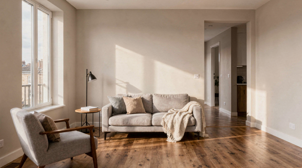
When I walk into a property with a camera, I’m not looking for the dramatic shot that belongs in a design magazine. I’m looking for the frame that answers the question every buyer or tenant silently asks: “Can I see myself here?” That shift in mindset changes everything about how you photograph a room. It moves the priority from impressing to informing, from styling to clarity. After years of shooting everything from empty studio apartments to sprawling commercial lofts, I’ve learned that the most effective property images are the ones that feel honest, intentional, and easy to read within the first three seconds.
For agents and homeowners, this means photographs should do more than document square footage. They should translate spatial experience into a two-dimensional frame so accurately that someone scrolling through a listing instinctively pauses and thinks, “That makes sense.”
What “real spaces for real people” means
There’s a common trap in property photography: trying so hard to make a room look impressive that you end up making it look confusing. I see it constantly — shots taken at 10mm on a full-frame sensor where the living room stretches into a bowling alley, or HDR blends so aggressive that the space loses all sense of depth and texture. The irony is that these images often generate clicks but fail to generate showings, because the viewer can’t actually decode what they’re looking at.
Our method starts with a different set of priorities. Before I press the shutter, I ask whether the frame will help someone answer these questions quickly:
- How big does the room actually feel, not just how big the wide-angle lens makes it look?
- Where is the natural light coming from, and how does it move through the space?
- Would a standard sofa fit against that wall, or is the perspective playing tricks?
- What is this room’s primary function, and is it immediately obvious?
- Does the space feel open, clean, and easy to imagine inhabiting?
This is why spatial accuracy, natural light behavior, and compositional discipline matter more than any editing preset. A good property image should be attractive, yes — but it should also be legible. If someone has to squint or guess, the photograph has already failed its core job.
The core principle: clarity beats dramatization
The most useful real estate images I’ve ever delivered were rarely the most theatrical ones. They were the frames where the verticals stayed vertical, the light felt consistent with what you’d actually see walking through the door, and the composition gave enough context to understand how the kitchen relates to the dining area or where the hallway leads.
This matters because buyers and tenants aren’t passively admiring your photography — they’re actively scanning for fit. They’re mentally placing their furniture, checking sightlines, gauging whether the bedroom will feel cramped or the office will have enough natural light for video calls. If a photo hides corners, distorts proportions with an ultra-wide lens pushed too far, or over-brightens the room into a featureless white box, it creates cognitive friction. The viewer has to work harder to reconstruct the space in their mind, and that effort weakens engagement. Every second of confusion is a second closer to swiping to the next listing.
Our photography workflow
Over hundreds of shoots, I’ve distilled the on-site process into three non-negotiable stages: prepare, shape, and verify. Skip any one of them, and the final image will carry the evidence of that shortcut.
1. Prepare the room
I’ve lost count of how many times I’ve arrived at a property where the owner or agent assumed the space was “camera-ready,” only to find visible clutter, tangled cables, half-closed blinds, and furniture pushed against walls at odd angles. Preparation isn’t about staging in the traditional sense — it’s about removing visual noise so the architecture can speak clearly.
Before the camera comes out of the bag, I walk through every room and address the obvious distractions:
- Clearing countertops, nightstands, and visible surfaces of personal items, mail, toiletries, and small clutter
- Opening blinds and curtains fully where daylight benefits the room, or adjusting them to control harsh glare
- Turning on all working lights — every lamp, every under-cabinet fixture, every pendant — to create consistent illumination and avoid dark pockets
- Fixing small but visually loud problems: crooked picture frames, visible trash bins, streaked mirrors, tangled cords, and misaligned furniture
- Aligning chairs, barstools, rugs, and bedding so the room reads as intentional rather than haphazard
This step isn’t about making every space look like a model home. It’s about eliminating the distractions that pull the viewer’s eye away from the room itself. A stray phone charger on the kitchen island might seem minor, but in a wide-angle shot, it becomes a visual anchor that competes with the actual subject.
2. Shape the light
Light is the single biggest differentiator between an average property photo and one that stops a scroll. It’s also where I see the most consistent failures in DIY listing photography — rooms that are technically bright but feel flat, harsh, or strangely colored because no one managed the light sources intentionally.
I prefer natural daylight whenever it works well, especially in rooms with generous windows and favorable sun direction. But “natural” doesn’t mean “uncontrolled.” A south-facing window at noon can blast a room with contrast so severe that the camera can’t hold detail in both the highlights and shadows. In those situations, I’ll balance the ambient light with strobes or LED panels, dialing in just enough fill to bring the shadows up without killing the natural feel. The goal isn’t to make every room look like it’s glowing from within — it’s to make the lighting feel honest, comfortable, and consistent with how the space actually experiences light throughout the day.
One practical note: I always check the color temperature of the room’s built-in bulbs before I start mixing light sources. A room lit by 5000K daylight LEDs with warm 2700K table lamps in the same frame creates a color clash that’s difficult to fully correct in post. When possible, I’ll swap bulbs to match, or I’ll commit to one dominant source and let the other fall into a supporting role.
3. Verify the composition
Before I move on from a room, I review each frame on the camera’s LCD with a specific checklist in mind. A strong composition should have:
- A clear subject — the room itself, not a piece of furniture or a window view that dominates the frame
- Straight vertical lines — converging verticals are the fastest way to make a room feel like it’s falling backward
- Believable proportions — the wide-angle lens should reveal space, not invent it
- Visible depth — at least two planes (foreground and background) so the room doesn’t read as a flat wall
- No distractions competing for attention — no bright exit signs, no reflections of my tripod in mirrors, no half-open doors cutting awkwardly through the edge of the frame
If the frame looks pretty but the room’s function is unclear, I adjust the angle or pull back to include more context. If the room reads accurately but feels lifeless, I refine the camera height or shift slightly to catch a diagonal that adds energy. Good property photography lives in that balance between accuracy and invitation, and it’s rarely achieved on the first attempt.
How we handle different types of spaces
One of the earliest lessons I learned was that a hallway, a living room, a kitchen, and an empty apartment demand fundamentally different visual strategies. Shooting every room with the same focal length, the same height, and the same compositional formula produces a gallery that feels repetitive and fails to communicate what makes each space distinct.
| Space type | Main goal | What we prioritize |
|---|---|---|
| Living room | Show comfort and flow | Wide but accurate angle (typically 16-20mm full-frame equivalent), seating layout that suggests conversation, daylight direction that defines the room’s character |
| Kitchen | Show function and cleanliness | Counter clarity with nothing distracting on surfaces, appliance alignment, even lighting that eliminates shadows under cabinets |
| Bedroom | Show scale and calm | Symmetry where it exists, soft diffused light, minimal visual clutter so the room feels restful rather than busy |
| Bathroom | Show cleanliness and finish | Reflection control (I often shoot bathrooms with the door open behind me to avoid mirror reflections), sharp lines, bright but natural exposure that preserves tile texture |
| Office or commercial area | Show usability and circulation | Desk arrangement, work zones, ceiling height, clear pathways that suggest how people move through the space |
| Empty property | Show size and potential | Composition that defines rooms without furniture, depth created by shooting toward corners or through doorways, light patterns that give the space life without making it feel cold |
The most common mistake I see — and one I made early in my career — is treating every room as a generic interior shot. A bathroom photographed with the same approach as a living room will feel cramped and awkward. A kitchen shot from too low an angle will emphasize the underside of cabinets rather than the workspace. Each space has a primary purpose, and the photograph should communicate that purpose within the first second of viewing.
Lighting: the difference between “lit” and “well lit”
A room can be objectively bright and still photograph terribly. I’ve walked into properties where every overhead light was blazing, yet the resulting images felt harsh, uninviting, and oddly dark in the corners. Brightness alone isn’t the goal — quality of light is.
What we look for
- Daylight that supports the room’s shape rather than flattening it with frontal glare
- Practical lighting (lamps, pendants, sconces) that adds warmth and depth without introducing a strong color cast
- Even exposure across windows, walls, and foreground — no blown-out window frames with zero exterior detail
- Consistent color temperature across all light sources in a single frame
Common lighting problems
- Blown-out windows that read as white rectangles, erasing any sense of the view or outdoor context
- Dark corners that make a room feel smaller and less inviting than it actually is
- Mixed warm and cool bulbs in the same frame, creating a patchwork of orange and blue that looks amateurish
- Strong overhead shadows cast across countertops, furniture, or — worst of all — the middle of the floor where they become the most visually dominant element
- Reflective surfaces (glass, polished stone, stainless steel) picking up glare from windows or lights, creating hot spots that draw the eye away from the room
Simple rule
If you notice the viewer’s eye going to the shadows, the window glare, or the color inconsistency before it goes to the room itself, the lighting needs work. The light should be invisible in its effect — felt, not noticed.
Composition that feels natural
Composition in property photography should guide the viewer through the space without announcing itself. The frame should feel steady, open, and effortless to read — which, paradoxically, takes significant effort to achieve.
Techniques we rely on
- Shooting straight into a room when that makes the layout clearest, typically from a doorway or an opening that provides natural framing
- Using corner angles when they reveal depth and the relationship between two walls without introducing aggressive distortion
- Keeping horizontal and vertical lines clean — I use the camera’s built-in level and often a geared tripod head to dial in precise alignment
- Placing the camera at a height that feels like a person standing in the room, typically around chest to eye level (roughly 1.5 meters), not at ceiling height or knee level
- Leaving enough breathing room around the edges of the frame so the room doesn’t feel cropped or claustrophobic
Here’s a practical test I use on every shoot: if someone looked at the photo for five seconds and then had to describe the room to a friend, could they do it accurately? If they’d struggle to explain the layout, the composition is probably trying too hard to be clever rather than clear.
How we make empty spaces feel real
Empty properties present a unique challenge. Without furniture to provide scale cues, rooms can feel undefined, cold, or smaller than they actually are. The solution isn’t to fake a lifestyle with digital staging that looks uncanny — it’s to photograph the architecture with enough structure and intention that the viewer can mentally furnish the space themselves.
In vacant listings, I emphasize:
- Floor area — shooting from a height and angle that lets the floor lead the eye into the room, giving a clear sense of usable square footage
- Ceiling height — including enough of the ceiling to communicate volume, especially in rooms with tall or vaulted ceilings
- Window placement — making windows a prominent element so the viewer understands natural light availability and wall space for furniture placement
- Built-in features — fireplaces, shelving, alcoves, and architectural details that give the room character independent of décor
- Traffic flow between rooms — shooting through doorways and openings to show how spaces connect
- Natural light patterns — letting sunlight fall across floors and walls to create shape and warmth without any staging at all
For vacant listings, composition carries even more weight because there are fewer objects to anchor the eye. In these cases, I’ll often shoot slightly wider than I would in a furnished room — not to exaggerate the space, but to ensure the architecture itself tells the full story. The room’s bones have to do all the work.
What we never sacrifice
Some principles stay consistent regardless of the property type, budget, or timeline. These are the lines I won’t cross because crossing them produces images that might look impressive on a portfolio but fail the viewer who’s trying to make a real decision.
Non-negotiables
- Accurate room shape — no stretching, no compressing, no perspective tricks that misrepresent dimensions
- Clean lines — verticals stay vertical, horizons stay level
- Believable color — white balance that reflects the actual lighting conditions, not an artificially cooled or warmed interpretation
- Visible function — every room’s purpose should be obvious without a caption
- Honest detail — if there’s a feature or flaw, it shouldn’t be hidden by editing or convenient framing
- No confusing distractions — the frame should be free of elements that pull attention without adding information
Things we avoid
- Extreme wide-angle distortion that makes a standard bedroom look like a ballroom
- Over-retouching that removes texture, depth, and the natural character of materials
- Clutter hidden only by cropping it out of the frame rather than physically removing it
- Lighting that looks artificial, inconsistent, or obviously supplemented in a way that breaks the illusion of walking through the space
- Heavy stylization — aggressive color grading, vignettes, or filters — that makes the property feel generic and untrustworthy
A photograph should help someone trust the space. If the image feels misleading, it might generate clicks and even inquiries, but it won’t build the confidence that leads to an offer. And in my experience, the disconnect between an over-polished photo and the real thing is one of the fastest ways to lose a potential buyer’s trust during a showing.
Our process on site
Here’s what a typical shoot actually looks like, step by step. It’s not complicated, but the discipline is in executing each step thoroughly before moving on.
Step-by-step workflow
- Walk through the entire property first — without the camera — to identify the strongest natural light and note which rooms will lose that light first as the sun moves.
- Decide the shooting order: rooms with the best daylight get shot first, typically living areas and master bedrooms with favorable window orientation.
- Remove obvious distractions and straighten each room — this is the preparation stage I described earlier, and it’s non-negotiable.
- Set the composition so the main lines stay clean, using a tripod and taking the time to check verticals and horizons before the first test shot.
- Check exposure for both interior detail and window detail — I typically bracket exposures and blend them later, but I verify on site that I’m capturing enough information in both the highlights and shadows.
- Review each frame on the camera’s LCD before moving to the next room — catching a crooked vertical or a distracting reflection on site saves an unusable image later.
- Re-shoot anything that feels cramped, crooked, or unclear — no exceptions, no “I’ll fix it in post.”
This process sounds simple because it is. The skill isn’t in the complexity of the workflow — it’s in noticing what the room needs before the camera starts dictating the result. That ability to read a space and anticipate how it will translate into a two-dimensional frame is what separates a competent shoot from one that genuinely serves the listing.
Practical checklist for better property photos
Use this before any shoot, whether you’re a photographer preparing for a job or an agent trying to improve your own listing images:
- Open curtains and blinds fully where daylight helps the room; adjust partially where direct sun creates harsh glare.
- Turn on every working light consistently throughout the space — lamps, overheads, under-cabinet, everything.
- Remove personal items, small clutter, visible cables, and anything that identifies the current occupants.
- Clean reflective surfaces and windows — smudges and streaks become magnified in wide-angle shots.
- Align chairs, rugs, pillows, and bedding so the room reads as intentional.
- Check that all bulbs in a given room match in color temperature — replace any outliers if possible.
- Make sure the main function of each room is obvious at a glance.
- Look for crooked frames, labels, trash bins, floor mats, and anything that draws the eye without adding value.
- Confirm that the photo shows the room’s depth, not just one flat wall.
- Review the frame for balance — is the visual weight distributed, or is everything clustered on one side?
Typical mistakes that weaken real estate and commercial space photos
After reviewing thousands of listing photos over the years — both my own early work and images sent to me by agents asking for feedback — I’ve noticed the same problems surfacing repeatedly. They’re rarely about expensive gear or advanced technique. They’re almost always about fundamentals that got skipped in the rush to publish.
The most common mistakes
- Too much wide-angle distortion — shooting at 12mm when 18mm would have shown the room honestly while still feeling spacious
- Not enough light control — relying entirely on ambient light without managing contrast, resulting in blown windows or murky corners
- Clutter left in the frame — personal items, paperwork, pet beds, and everyday detritus that signal “someone else lives here”
- Mixed lighting colors — warm lamps and cool overheads in the same shot, creating a color clash that looks careless
- Awkward camera height — too high feels like a security camera; too low emphasizes ceilings and undersides of furniture rather than the living space
- Compositions that cut off the room’s layout — shooting too tight so the viewer can’t understand how the space connects to adjacent rooms
- Editing that makes the image look fake — over-sharpened edges, unnatural saturation, or HDR halos that scream “processed”
Why these mistakes matter
They erode trust. A buyer or tenant may not consciously identify what’s wrong with the photo, but they’ll feel that something is off. That subtle discomfort translates into hesitation — and hesitation means fewer inquiries, fewer showings, and longer days on market. I’ve had agents tell me that simply replacing distorted, cluttered listing photos with clean, accurate images cut their time-to-offer noticeably. The photos aren’t the only factor, but they’re often the first one a potential buyer encounters, and first impressions in real estate are difficult to undo.
Before-and-after thinking: how we judge success
I don’t evaluate a shoot by how dramatic the final images look compared to the raw files. I evaluate it by how much easier it is to understand the property after the photographs exist. A successful before-and-after shift — whether it’s a professional reshoot replacing DIY photos or simply the transformation from unprepared room to final frame — usually looks like this:
- The room feels brighter, but not washed out — there’s still texture in the walls, depth in the shadows, and detail in the highlights.
- The layout is easier to read — someone can glance at the photo and immediately understand the room’s shape, size, and relationship to adjacent spaces.
- The space feels cleaner without looking sterile — it’s inviting, not clinical.
- The viewer can imagine living or working there — the photo triggers that mental projection rather than blocking it with confusion or distrust.
- The image matches the property in real life — when someone walks through the door, the room confirms the photo rather than contradicting it.
That last point is the one I care about most. A photograph that overpromises and underdelivers might win the click, but it loses the sale. A photograph that accurately represents the space builds momentum from online listing to in-person showing to offer.
Why this approach works for agents and homeowners
For agents, strong property photography supports faster comprehension and better first impressions — which translates directly into more qualified showings and shorter listing cycles. When a buyer arrives at a property already understanding the layout, they spend less time orienting and more time emotionally connecting with the space.
For homeowners, this approach helps the property present itself at its genuine best without feeling artificial or misleading. The goal isn’t to create a fantasy version of the home — it’s to remove the barriers that prevent someone from seeing its actual potential.
This method works because it respects the viewer’s intelligence. It doesn’t assume people want a stylized, magazine-spread version of the room. It assumes they want to understand the space quickly, clearly, and honestly — so they can make a confident decision. That’s especially critical in residential listings, rental properties, commercial spaces, and short-term rentals, where the photograph often carries the entire weight of the first impression.
A simple way to evaluate your own property photos
After every shoot — or after reviewing any set of listing images — I run through these five questions. They cut through the subjectivity and get to whether the photo is actually doing its job:
- Does the room look clean and intentional, or does it feel like someone just walked out?
- Can I tell how the space is used within the first second of looking?
- Does the light feel natural, or is it fighting the room?
- Are the lines straight and the proportions believable, or does something feel subtly wrong?
- Would I want to click deeper into this listing, or does the image make me want to scroll past?
If the answer is “no” to two or more of those, the image probably needs a reshoot or a much tighter edit. I’ve learned to trust that discomfort — if a frame bothers me on site, it will bother the viewer too, even if they can’t articulate why.
Final takeaway
Photographing real spaces well isn’t about chasing perfection or creating images that belong in a design portfolio. It’s about producing honest, useful, visually clear photographs that help real people make real decisions. When a photo respects the room — its light, its proportions, its purpose — the room tends to sell itself more effectively.
That’s the approach I bring to every project: clear light, clean composition, practical preparation, and an unwavering focus on how the space actually lives. Not how it might look with enough editing, but how it feels when you’re standing in it — translated faithfully into a frame that makes someone want to take the next step.
FAQ
What makes a real estate photo effective?
A strong photo shows the room clearly and honestly. It uses natural-looking light, keeps vertical lines straight, maintains believable proportions, and helps viewers understand the layout within seconds. Effectiveness isn’t about drama — it’s about legibility and trust.
Should every room be staged heavily?
No. Staging should support the space, not overwhelm it. The goal is clarity and function — helping the viewer understand how the room works and what it feels like to be in it. Over-staging can distract as much as clutter can.
What is the biggest mistake in property photography?
The most common and damaging issue is sacrificing accuracy for visual drama. Over-wide lenses that distort proportions, poor light control that creates harsh shadows or blown windows, and cluttered frames that confuse the eye all make a property feel less trustworthy — and trust is everything in real estate.
How important is natural light?
Natural light is extremely important when it works well — it’s the most flattering and believable light source for interiors. But it still needs to be managed and balanced so the room remains readable, the colors stay consistent, and the windows don’t become featureless white rectangles.
Can empty rooms still photograph well?
Absolutely. Empty spaces can look strong and inviting when composition, light, and depth are handled carefully. The key is to make the architecture easy to read — emphasizing floor area, ceiling height, window placement, and natural light patterns so the viewer can imagine furnishing the space themselves.