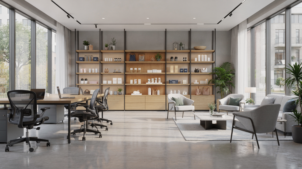
Commercial interiors sell trust before they sell space. When I walk into an office suite, a boutique, or a hotel lobby with my camera, the first question isn’t about aperture or composition — it’s about what this space needs to communicate to the person who will eventually sign a lease, book a room, or walk through the door as a customer. A strong photo set should help a prospect understand layout, atmosphere, functionality, and brand fit in a few seconds. The goal is not just to make a room look good — it is to make the space feel usable, valuable, and worth visiting.
Why commercial space photography is different
Offices, retail stores, and hospitality venues each serve a different business goal, so the photography must support that goal. I learned this the hard way early in my transition from portrait work — treating a law firm’s conference room the same way I’d shoot a café lounge produced images that felt disconnected from what the client actually needed.
- Offices need to show professionalism, capacity, and workflow. A potential tenant isn’t looking for atmosphere; they’re calculating headcount and imagining their team in the space.
- Retail spaces need to show merchandising, circulation, and customer experience. The photos should make someone feel like they’re already browsing the aisles.
- Hospitality spaces need to show mood, comfort, and service quality. Here, emotional response drives decisions more than square footage ever will.
That means a one-size-fits-all approach usually fails. A beautiful wide shot is helpful, but it is not enough on its own. Buyers, tenants, investors, and customers also want to see how people move through the space, where the key features are, and what the brand experience feels like. I’ve had commercial agents tell me that a single well-placed detail shot of a reception desk’s material finish did more to convey “premium” than three wide angles of the same lobby.
Start with the intended use of the images
Before you pick up the camera, define where the photos will be used. This isn’t just about shot lists — it’s about aspect ratios, negative space, and how much context each frame needs to carry.
- Leasing brochures
- Website hero images
- Google Business Profile
- Social media
- Press kits
- OTA and booking platforms
- Internal marketing decks
The use case affects the framing, crop room, and shot list. A website banner needs negative space — I typically leave 30-40% of the upper third clear for text overlay. A leasing brochure needs clear layout coverage; agents want to point to specific zones during tours. A booking platform needs atmosphere and consistency across all images so the property feels coherent. I always ask clients to share examples of where the photos will live before I plan my shot list. It changes how I frame from the first click.
Pre-shoot planning checklist
Good commercial interiors are won in preparation, not in post-production. I’ve spent hours in editing trying to fix things that could have been resolved in thirty seconds on location. The most expensive post-processing is the kind that tries to rescue a shoot that wasn’t ready.
Pre-shoot checklist
- Confirm access times and any security rules. Some buildings require escorts; others have strict no-tripod policies in certain areas.
- Ask who must approve final images. Knowing the decision-maker upfront prevents revision cycles that drag on for weeks.
- Clear desks, counters, and visible storage. Every surface should look intentional, not abandoned mid-task.
- Remove confidential documents, passwords, and branded employee items. I once caught a whiteboard with login credentials in a corner office shot — that’s a liability, not just an aesthetic issue.
- Replace burned-out bulbs. Mixed lighting is hard enough without dead fixtures creating dark pockets.
- Clean glass, mirrors, chrome, and tabletops. Fingerprints and smudges catch light in ways that are impossible to ignore at full resolution.
- Turn on all usable lighting. Even if ambient light is strong, practical lights add depth and warmth.
- Decide whether the space should look empty, active, or staged. This affects everything from furniture placement to whether I bring in styling elements.
- Prep any screens, signage, or digital displays. Blank screens look abandoned; content needs to be relevant and approved.
- Walk the space and remove temporary clutter. That stack of boxes in the corner? It’ll be the first thing your eye goes to in the photo.
Common mistakes during prep
- Leaving one cluttered desk in an otherwise clean office. The eye finds disorder instantly, and it undermines the professionalism of the entire set.
- Mixing warm and cool bulbs across the same room. This creates color casts that are tedious to correct and often impossible to fully fix without making the space look unnatural.
- Forgetting fingerprints on glass partitions. Conference room shots with smudged glass look careless, and clients notice.
- Leaving menu boards, screens, or whiteboards blank. Empty digital displays read as “closed” or “out of business” in photos.
- Shooting before housekeeping finishes. I’ve arrived to find vacuum cleaners in frame and wet floors reflecting light unpredictably. Timing matters.
A clean, coordinated space photographs far better than a “pretty” space with small distractions everywhere. I tell clients: if you notice it in person, the camera will amplify it.
How to photograph offices
Office photography should communicate clarity, productivity, and scale. When I photograph an office, I’m thinking about how a business owner or facilities manager will evaluate the space — they’re mentally placing departments, counting workstations, and assessing whether the layout supports their operations. For most office spaces, the best images are a mix of wide establishing shots, functional middle-distance views, and detail shots.
Best office shots to capture
- Reception or lobby entrance
- Main open-plan work area
- Conference room
- Private offices
- Collaboration areas
- Break room or pantry
- Hallways and circulation
- Building amenities if relevant
How to compose office photos
Use straight lines and controlled perspective. This is non-negotiable in office photography — tilted verticals make a space feel unstable, and corporate clients are particularly sensitive to this. Shoot from corners when you want to show depth, and from mid-room when you want to show symmetry and layout. Keep vertical lines straight and avoid tilting the camera upward unless the architecture really benefits from it. I use a geared head for precise adjustments; it’s slower but eliminates the subtle keystoning that creeps in when you rush.
A useful rule: if the space is about workflow, show how the room functions. If it is about prestige, show materials, light, and finish quality. A tech startup’s open floor plan needs different treatment than a law firm’s corner office with wood paneling and leather chairs.
Office photo angles that work well
| Shot type | Why it works | Common mistake to avoid |
|---|---|---|
| Corner-to-corner wide shot | Shows size and layout | Including too much ceiling or floor |
| Straight-on conference room shot | Feels organized and balanced | Crooked lines and uneven chairs |
| Reception angle | Supports first-impression branding | Hiding the desk behind clutter |
| Through-glass shot | Adds depth and a modern feel | Reflections from lights and windows |
| Detail shot | Highlights quality and brand identity | Too many random decorative items |
Include people carefully
A few well-placed people can make an office feel active and credible. One person walking through frame, a small meeting in progress, or a presenter at the head of a conference table can add life. I typically position people in the midground or background rather than front and center — they should support the space, not dominate it. Keep it natural and do not overcrowd the scene. I’ve found that three to five people in a large open-plan office reads as “productive”; twenty reads as “chaotic.”
Avoid:
- Stiff posing
- Overly staged “stock photo” gestures
- Faces and branding without permission
- Screens with readable private information
How to photograph retail stores
Retail photography needs to do two jobs at once: show the store clearly and make it feel shoppable. The photos should explain how customers move through the space and what makes the brand experience distinct. When I photograph a retail environment, I’m thinking about sightlines from the entrance, how product density reads in two dimensions, and whether the images make someone want to walk through the door.
Best retail shots to capture
- Exterior storefront and signage
- Entrance view looking inward
- Main sales floor
- Product displays
- Checkout area
- Fitting rooms if relevant
- Aisles or traffic paths
- Feature walls and branded visuals
What retail photos must communicate
Retail buyers want to see:
- Visibility from the street
- Ease of entry
- Product organization
- Customer flow
- Brand atmosphere
- Display quality
That means your camera position matters. Photograph from the entrance, down the main aisle, and from customer eye level whenever possible. Those angles help viewers imagine what it feels like to shop there. I typically set my tripod at roughly 140-150cm — slightly below average eye height — because it makes the space feel accessible without distorting scale.
Retail photography tips
- Turn on every working light. Retail lighting is designed to make merchandise look appealing; use it.
- Open blinds where window light helps. Natural light mixed with display lighting creates depth that pure artificial light can’t replicate.
- Straighten racks, shelves, and display tables. Even a slight angle reads as sloppy in photos.
- Align product labels and signage. Consistency communicates attention to detail.
- Leave clear pathways for movement. Cluttered aisles suggest poor management.
- Capture both wide and detail shots. The wide shot shows the store; the detail shot shows the merchandise quality.
Strong retail storytelling shots
- Entrance looking into the store
- View from the back toward the front
- Close-up of a signature display
- Checkout counter with the brand visible
- Product wall with clean spacing
- Lifestyle moments if the store is staffed
Retail mistakes to avoid
- Crooked product displays
- Tight crops that hide circulation
- Mixed color temperatures from different bulbs
- Overloaded shelves that look messy instead of busy
- Reflective glare on glass cases and mirrors
In retail, clutter reads as confusion. Organization reads as premium. I’ve watched property listings sit for months because the photos showed a store that looked chaotic — even though the location and foot traffic were excellent. The images didn’t match the reality, but buyers only had the images to judge by.
How to photograph hospitality spaces
Hospitality photography has the widest emotional range. A hotel lobby, restaurant, spa, or café may need to feel warm, elegant, energetic, relaxed, or luxurious depending on the brand. This is where my portrait background most influences my approach — I’m reading the light the way I would for a person, looking for how it shapes mood and directs attention.
Best hospitality shots to capture
- Exterior arrival view
- Lobby or entrance
- Guest seating areas
- Dining room or bar
- Guest rooms or suites if applicable
- Bathrooms or premium amenities
- Outdoor seating or terrace
- Signature details like lighting, textures, table settings, or service pieces
Hospitality images should feel lived-in, but controlled
The space should not look sterile. A hospitality photo set should suggest service and comfort without looking messy or unpolished. This is a delicate balance — too perfect reads as uninviting; too casual reads as unprofessional. Small styling choices matter:
- Set the table. A single place setting with a folded napkin and glassware suggests readiness.
- Place towels or amenities neatly. In hotel bathrooms, I fold towels with clean edges and arrange toiletries with consistent spacing.
- Tidy chairs and cushions. Push chairs in or pull them out slightly — but be consistent across the frame.
- Turn on practical and decorative lighting. Table lamps and sconces create pools of warmth that make spaces feel intimate.
- Add subtle signs of readiness, not occupancy. A menu placed on a host stand, a coffee cup at a café table — these suggest the space is waiting for someone, not that someone just left.
Timing matters
For restaurants, cafés, and event spaces, shoot during quiet windows:
- Before service
- Between service periods
- After setup is complete
- When the room is ready but not crowded
For hotels and resorts, aim for times when natural light is soft and directional. Exterior and window-heavy areas often look best in early morning or late afternoon, while interiors may benefit from mixed ambient and practical lighting. I’ve shot hotel lobbies at 6:30 AM when the morning light streams through east-facing windows and the space is empty except for a single staff member at the desk — those images consistently outperform midday shots where harsh light and guest activity compete for attention.
Lighting strategy for commercial interiors
Lighting is the difference between flat documentation and polished commercial imagery. The goal is usually to balance natural light with interior lighting so the room feels real and intentional. I approach commercial lighting the way I approached portrait lighting: identify the key light source, manage the fill, and control the shadows.
Practical lighting approach
- Start with all usable lights on. Interior fixtures provide warmth and depth that window light alone can’t deliver.
- Open blinds if the outside view is not distracting. A blown-out window is acceptable if the exterior isn’t relevant; a view of a brick wall or parking lot should be managed carefully.
- Watch for mixed color temperatures. This is the most common lighting problem I encounter — warm overheads mixing with cool window light, or different bulb types in the same room creating patchy color casts.
- Use window light as a base, not a crutch. Natural light is beautiful but inconsistent; build your exposure around it rather than relying on it entirely.
- Add supplemental light only where needed. I use portable LED panels rather than speedlights for commercial work — the continuous light lets me see exactly what I’m getting.
When to use supplemental lighting
Consider extra light when:
- The space is dark and windowless. Conference rooms in building cores often need help.
- Ceiling lights create heavy shadows. Downlights can cast unflattering shadows on faces and surfaces.
- You need to balance a bright window with a darker interior. This is the classic HDR scenario, but supplemental light often produces more natural results than heavy bracketing.
- The brand requires a more controlled, editorial look. Some hospitality clients want a specific mood that ambient light alone can’t achieve.
Avoid blasting the room with direct flash. In commercial interiors, harsh light can flatten textures and make the space feel artificial. I’ve seen flash photography turn a warm, inviting restaurant into something that looks like an evidence photo. If you’re using flash, bounce it or diffuse it heavily.
Quick lighting checklist
- All bulbs matched where possible
- No dead fixtures
- Window glare controlled
- TVs and monitors adjusted
- Light sources balanced across the room
- Reflective surfaces checked from camera position
Gear that helps, without overcomplicating the job
You do not need every accessory available. You do need stable, repeatable tools. My commercial kit is simpler than most people expect — I’ve learned that reliability matters more than having every focal length covered.
Useful gear for commercial spaces
- Wide-angle lens for full-room coverage
- Standard lens for mid-range compositions
- Tripod for sharpness and consistency
- Remote release or timer
- Polarizer for some reflective surfaces
- Portable light sources if the space is challenging
Lens choice guide
| Lens range | Best for | Watch out for |
|---|---|---|
| Wide-angle | Small rooms, full interiors | Distortion if used too close |
| Standard | Balanced, realistic perspective | May not show enough context in tight spaces |
| Short telephoto | Details, decor, signage | Can flatten the sense of space |
A wide lens is useful, but it should not make the room look false. Keep straight lines controlled and avoid stretching the edges of the frame. I typically shoot commercial interiors at 16-24mm on full-frame — wide enough to show context, but not so wide that the room looks twice its actual size. Buyers and tenants feel deceived when they visit a space that looked significantly larger in photos, and that erodes trust immediately.
A simple shooting workflow
Working methodically will save time on every commercial assignment. I developed this workflow after too many shoots where I’d realize at the editing stage that I’d missed a critical angle because I jumped around the space without a system.
Step-by-step workflow
- Walk the space and identify the strongest angles.
- Turn on all lights and fix obvious prep issues.
- Shoot the hero wide shots first.
- Capture functional angles for layout and circulation.
- Add medium shots of rooms and zones.
- Finish with details, branding, and texture.
- Review for crooked lines, hotspots, and clutter.
- Reshoot anything that does not clearly show the space.
Suggested shot order
- Exterior/context shot
- Entry shot
- Main wide room shot
- Secondary angle
- Functional zone shots
- Detail shots
- People-in-space shots, if needed
This order helps you cover the essential story before fatigue, staff movement, or changing light start to affect consistency. I’ve learned that light shifts faster than you expect — a window that was perfectly exposed at 10:15 AM can be completely blown out by 10:45. Get the critical shots first.
Post-processing priorities
Editing should make the space look accurate, clean, and inviting — not fake. My editing philosophy for commercial work is restraint: if someone who’s been in the room can’t recognize it from the photo, I’ve gone too far.
Focus your edits on
- Straightening verticals and horizontals
- Balancing exposure
- Correcting white balance
- Removing minor distractions
- Keeping colors natural
- Preserving architectural detail
Avoid over-editing
- Oversaturation
- Over-sharpening
- Unrealistic HDR halos
- Ultra-warm lighting that changes the mood of the room
- Removing real architectural features that define the space
Commercial clients usually want reliability more than dramatic effects. If the image feels believable, it will work harder. I’ve had property managers tell me they prefer slightly conservative edits because they don’t want tenants accusing them of misrepresentation. That’s a valid concern — and one that guides how I process every commercial file.
Delivery formats that clients actually need
A strong shoot is wasted if the file delivery does not match the platform. I’ve delivered beautiful full-resolution images only to have clients ask for web-sized versions the next day. Now I ask upfront.
Export variations to prepare
- Full-resolution master files
- Web-optimized JPGs
- Cropped horizontal hero images
- Vertical versions for social
- Square crops for profile platforms
- Detail crops for ads or feature cards
If the client has multiple channels in mind, ask for the intended crop ratios before editing begins. It’s far easier to compose with the final crop in mind than to reframe in post.
Common mistakes and how to fix them
| Mistake | Why it hurts | Better approach |
|---|---|---|
| Showing cluttered desks | Looks unfinished | Clear surfaces before shooting |
| Shooting too high | Distorts scale | Use a tripod at a controlled height |
| Ignoring reflections | Distracts from the room | Check glass, mirrors, and screens from camera position |
| Overusing ultra-wide focal lengths | Makes spaces feel fake | Use the widest useful lens, not the widest possible lens |
| Leaving lights half-on | Feels careless | Test every zone before the first frame |
| Forgetting detail shots | Misses brand story | Capture textures, signage, and finish quality |
Quick checklist by space type
Office photography checklist
- Reception
- Workstations
- Conference room
- Private office
- Break area
- Clean screens and desks
- Balanced lighting
Retail photography checklist
- Storefront
- Entrance view
- Main aisles
- Product displays
- Checkout
- Wayfinding and signage
- Clean glass and organized merchandise
Hospitality photography checklist
- Arrival or exterior
- Lobby or seating area
- Dining or bar space
- Rooms or suites
- Amenities
- Styled tables or service settings
- Warm, welcoming lighting
FAQ
What is the best time of day to photograph commercial interiors?
Use the time that gives the cleanest balance between natural light and interior lighting. For many spaces, morning or late afternoon works well, but the best timing depends on windows, reflections, and the building’s orientation. I’ve shot south-facing retail spaces where midday sun created harsh glare across the entire sales floor — the solution was returning at 4 PM when the light softened and angled differently.
Should commercial spaces be photographed empty or in use?
Both can work. Empty spaces are better for layout and leasing — they let the architecture speak without distraction. Spaces in use are better when the goal is to show atmosphere, service, or brand energy. I’ve done shoots where we captured the space both ways: empty in the morning for leasing materials, then with staff and activity in the afternoon for brand marketing.
Do I need people in office or retail photos?
Not always, but a few people can make the space feel active and believable. Keep people purposeful and avoid crowding the frame. One or two people in a large office reads as “functional”; a crowd reads as “over capacity.” I always get signed releases when faces are recognizable.
How do I make a small commercial space look larger?
Use corner angles, keep lines straight, clean the frame carefully, and avoid placing the camera too low or too close to large objects. Shooting from a corner expands the visible floor area, and keeping the camera at chest height prevents the ceiling from dominating the frame. But be honest — stretching a 200-square-foot office to look like 400 square feet only creates frustration during showings.
What matters more: lighting or composition?
They matter together, but composition usually comes first. Good composition shows the space clearly; good lighting makes it feel premium and usable. I’ve seen beautifully lit photos of poorly composed rooms — they’re still confusing to look at. Start with strong composition, then layer in lighting that supports the space’s purpose.
Final takeaways
Photographing offices, retail stores, and hospitality spaces is about more than making interiors look attractive. The best images explain how the space works, what it feels like, and why it is worth attention. When you combine clean prep, controlled lighting, smart angles, and careful editing, you create images that support leasing, booking, branding, and sales at the same time. The commercial clients I work with don’t just want pretty pictures — they want images that do a job. And the most effective commercial photos are the ones where every decision, from lens choice to styling to post-processing, serves that job without drawing attention to itself.